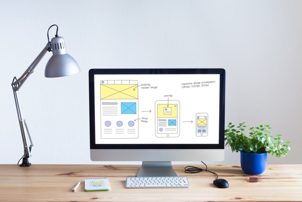
The creation of a website is more than just providing simple function and information. It is a key component of your marketing strategy. When a person visits your website, you want them to move through it to get the information they need and then make a purchase. However, poor navigation is a common problem for nearly all websites. As they get older and outdated, websites can actually hinder your ability to sell.
What Is Going Wrong?
It is important to address all types of website navigation. In short, you want a person to be able to move through the site without any frustration or anything that could hinder their ability to get to the buy page. Take a look at some of the most common problems associated with many of today’s websites.
Your Navigation Bar Is Hard to Locate
Most website owners want to stand out. They want a website they can use to capture the attention of the reader. But, you don’t want to do so much that you limit their ability to move through the site. A common problem is placing key features out of the normal range. You may, for example, move the navigation bar, with links to each of your website’s pages, to a different, non-normal location. This can stop people in their tracks. Allow them to do what they normally do.
You Lack Specific Naming on Your Pages
It is very common for websites to feature links to secondary pages on the home page. But, if you want someone to click on a link to go to the next page, you need to tell them exactly where they are going. For example, if you have a label that says “Services” you may be creating a missed opportunity for the customer who wants to find a way to incorporate a keyword or some other description, that tells them what type of service you offer right from the start.
Minimize Drop Down Menus
When creating the navigation for your website, you want to give people easy-to-find links to let them move through the site. But you also want to use these links as a way to help search engines to move through the website. As they do, they are able to rank your website higher in the search engine results pages. Drop down menus make this hard to do.
But, a bigger problem is the customer him or herself. When they arrive at your page, some drop-down menus can cause frustration. Let’s face it, sometimes drop down menus make moving through a site difficult. Whenever possible, avoid these. In some cases, you may need them to provide enough links on your site to various pages. But, you don’t need 20 links in each one.
Long Lists of Links
A common homepage mistake is having a long list or menu on the side of the page with dozens of products. This can become overwhelming for the visitor. And, all of those links just create more areas of frustration. You want to be sure you limit the number of links on that home page. Concise navigation like this is good for the search engines. It allows for easy use for your customers. And, that, makes is a must for you.
Too Many Graphics
Gone are the days when top-heavy graphics were a good thing. You no longer will find websites with flashy sales ads and pop-ups. If you are still using these, it is likely to cost you significantly. Instead, choose better coloring and design to ensure a more professional look.
People do not want to be sold to online. They want to come to the decision to buy over time based on the information you provide and the overall impression they get from your website. For this reason, you need to update your graphics, color scheme, and even the logo you use to reflect this. Move away from the cartoon-like elements to beautiful pictures and clear text. It can do wonders for any business.
Are you making the right decisions with your website layout? Sometimes, navigation is hard to tackle simply because you want to give your visitors every opportunity to get what they want. Let our team help you. For website redesign in West Chester, Pa., contact our team. Let us provide a review of your website to look for common website mistakes limiting your success. Our West Chester website design team is happy to discuss options with you.